PopupButton
PopupButton class is a specialized button that combines the functionality of a standard button with a popup widget.
The PopupButtonclass extends the Button class and provides additional functionality to display a popup widget. It includes features like:
- A dropdown arrow to indicate a popup.
- A popup widget that can be displayed when triggerd.
- Customized trigger action and popup widget.
- The ability to set or retrieve the associated widget.
popup widget
The widget property allows you to retrieve or set the popup widget associated with the button.
direction
The direction property specifies the direction in which the popup will appear (e.g., up, down, left, right).
If there is insufficient space in the specified direction, the popup will automatically adjust to another direction.
toggled
The toggled property indicates whether the popup button is currently toggled (active).
Trigger
The trigger parameter allows you to define how the popup is activated. The triggers include:
- Trigger.Click: Activate the popup when the button is clicked.
- Trigger.RightClick: Activate the popup when the button is right clicked.
- Trigger.DoubleClick: Activate the popup when the button is double clicked.
- Trigger.MouseHover: Activate the popup when the button is hovered over.
- Trigger.Focus: Activate the popup when the button become focused.
Event
About to Showed Event
About to Hidden Event
Example Code
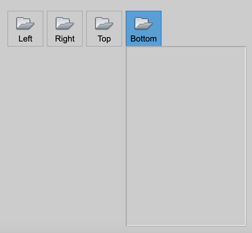
Create a popup button
Here we will create four popup buttons, each with a pop-up panel which we just leave black.
const desktop = Desktop.instance();
const layout = new HBoxLayout(desktop);
layout.addSpacer();

const mode = Button.LargeIcon | Button.Text | Button.Vertical;

const width = 60;
const leftButton = new PopupButton(layout, 'Left', getImage('AppMenu-Open_32'));
leftButton.mode = mode;
define the pop-up widget
const widget1 = new Panel();
widget1.size = new Size(200, 300);
leftButton.widget = widget1
leftButton.direction = Direction.Left;
leftButton.width = width;