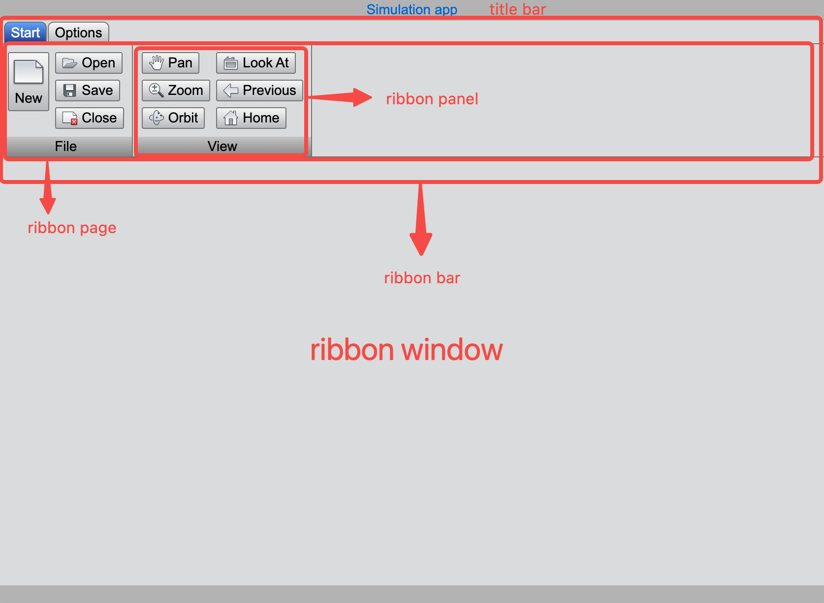
Building Ribbon Window
Ribbon menu is a user interface design pattern that organizes menu features into groups and displays them as tabs, offering an ituitive and streamlined user experience. When an application has numerous features, a ribbon menu helps categorize and group them logically, avoiding the clutter of traditional dropdown menus.
An application include mutiple ribbon menu pages, which are usually switched via tabs at the top of the ribbon bar. This example demostrates how to create feature-rich ribbon menu pages and organize them into the main window. Typically, a ribbon menu page consists of multiple ribbon panels, each representing a different functional group or category.
Importing Ribbon Modules
import { Orientation, ToggleButton, Button, ComboBox, TableWidget } from 'wui.basic';
import { RibbonPanel, RibbonPage } from 'wui.component';
import { RibbonWindow } from 'wui.framework';
import "./theme";
we will build the ribbon menu step by step, starting from smaller components like ribbon panels, progressing to ribbon pages, and finally integrating them into a ribbon window.
Ribbon Panel
A RibbonPanel object can contain various types of components such as buttons, combo boxes, labels, and text editors. Let’s start by creating a File ribbon panel and gradually add components to enhance its functionality.
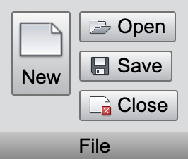
Creating a Ribbon Panel
const filePanel = new RibbonPanel();
filePanel.title = 'File';
Adding Button into the Panel
Create a button component with the filePanel as its parent and set its display mode to 'LargeIcon' and 'Vertical'.
const newButton = new Button(filePanel, 'New', getImage('Launch-New_32'));
newButton.mode = Button.LargeIcon | Button.Text | Button.Vertical;
Adding a Ribbon Group
Add a RibbonGroup to the ribbon Panel. You can specify the layout of the group as either Vertical or Horizontal. Then, we add three new buttons to it, arranging them vertically.
const fileButtonGroup = filePanel.addGroup(Orientation.Vertical);
new Button(fileButtonGroup, 'Open', getImage('AppMenu-Open_32'));
new Button(fileButtonGroup, 'Save', getImage('AppMenu-Save_32'));
new Button(fileButtonGroup, 'Close', getImage('App_Menu_Close'));
This completes the creation of a RibbonPanel object. You can continue to create additional panels, such as viewPanel and settingPanel.
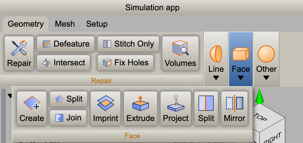
Ribbon Page
A RibbonPage is a container for organizing ribbon panels. When you add multiple panels to a ribbon page, they are arranged from left to right. If the window width is insufficient, panels on the right will automatically collapse, hiding their child objects. However, clicking the panel's dropdown arrow will display its components below the ribbon bar.
// startRibbon
const startRibbon = new RibbonPage();
startRibbon.add(filePanel, getRibbonImage('file'));
startRibbon.add(viewPanel, getRibbonImage('view'));
startRibbon.add(viewPanel1, getRibbonImage('view'));
The code above creates a RibbonPage object. You can continue to create additional ribbon pages as needed.
Ribbon Window
To finalize the layout, initialize a RibbonWindow object, which serves as the main container for the interface. Then, add the previously defined ribbon menu pages to the ribbon bar of the window.
// ribbonWindow
const ribbonWindow = new RibbonWindow();
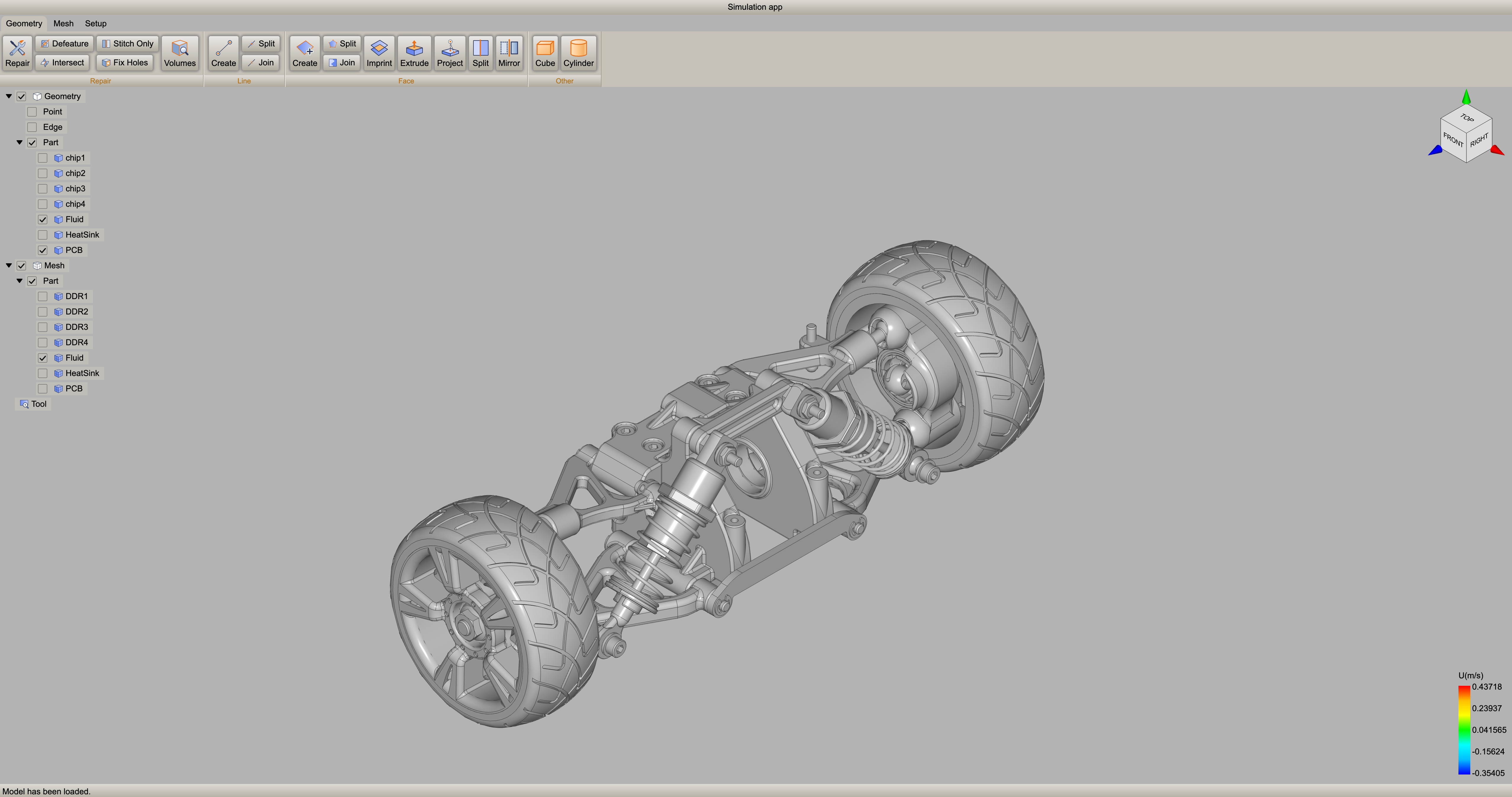
ribbonWindow.titleBar.title = "Simulation app";
// ribbonBar
const ribbonbar = ribbonWindow.ribbonBar;
ribbonbar.add(startRibbon, 'Start');
ribbonbar.add(optionsRibbon, 'Options');
ribbonbar.updateSize();
window.addEventListener('resize', (): void => {
    ribbonbar.updateSize();
});
By following the steps above, you can successfully create a feature-rich, well-organized Ribbon window that provides an enhanced user experience. The Ribbon menu's intuitive layout and dynamic resizing capabilities make it an excellent choice for applications with a wide range of features.