TabWidget
Detailed Description
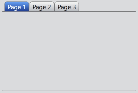
The TabWidget class provides a stack of tabbed widgets. A tab widget provides a tab bar and a page area that is used to display pages related to each tab. By default, the tab bar is shown above the page area, but different configurations are available (see TabPosition). Only the current page is shown in the page area, all the other pages are hidden. The user can show a different page by clicking on its tab.
Call add() or insert() to put the page widgets into the tab widget, giving each tab a suitable label. You can change a tab's text and icon using setTabText() or setTabIcon().
Event
The index change event is emitted whenever the current index changes either through user selects a page or programmatically.
// Listen for the index change event
tabWidget.bind('indexChanged', (event: IndexChangeEvent): void => {
    event.index; // The index of the current page.
});
Example code
In the code below, you will create a tab widget:
const desktop = Desktop.instance();
const tabWidget = new TabWidget(desktop);
tabWidget.size = new Size(380, 320);
const page1 = new Widget();
const page2 = new Widget();
const page3 = new Widget();
tabWidget.add(page1, 'Page 1');
tabWidget.add(page2, 'Page 2');
tabWidget.add(page3, 'Page 3');
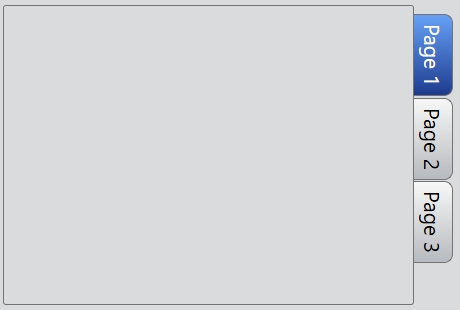
If you want the tabs are drawn to the right side of the pages:
...
tabWidget.tabPosition = TabPosition.East;
...