MessageDialog
Detailed Description
The MessageDialog class is a modal dialog for informing the user or for asking the user a question and receiving an answer. A message dialog can also display an icon and standard buttons for accepting a user response.
A message dialog supports four predefined message levels, or message types, which really only differ in the predefined icon they each show. Specify one of the four predefined message types by setting the icon property to one of the predefined icons. The following rules are guidelines:
| Icon | Name | Description |
|---|---|---|
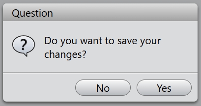
 | Question | For asking a question during normal operations. |
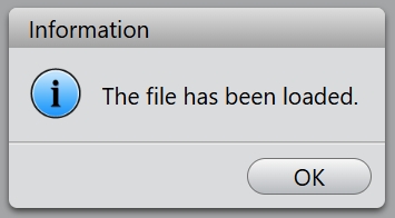
 | Information | For reporting information about normal operations. |
 | Warning | For reporting non-critical errors. |
 | Critical | For reporting critical errors. |
A message dialog supports four standard buttons, these enums describe flags for standard buttons:
| Constant | Value | Description |
|---|---|---|
| Ok | 0x0001 | An "OK" button. |
| Cancel | 0x0002 | A "Cancel" button. |
| Yes | 0x0004 | A "Yes" button. |
| No | 0x0008 | A "No" button. |
Example code
Static functions are available for creating, they are information(), question(), warning() and critical().
MessageDialog.information('Information', 'The file has been loaded.', MessageDialog.Ok);
You can get the button which is clicked inside the callback function.
const buttons = MessageDialog.Yes | MessageDialog.No;
const buttonCallback = (button: number): void => {
    switch (button) {
        case MessageDialog.Yes:
            // "Yes" Button was clicked
            break;
        case MessageDialog.No:
            // "No" Button was clicked
            break;
        default:
            // should never be reached
            break;
    };
};
MessageDialog.question('Question', 'Do you want to save your changes?', buttons, buttonCallback);