ComboBox
Detailed Description
The ComboBox class is a selection widget that displays the current item, and provides a dropdown list of selectable items.
A combobox can be populated using the insert functions, add() and insert(). An item can be removed with remove() and all items can be removed with clear(). The index of the current item is returned by index().
Event
The index change event is emitted whenever the current index in the combobox changes either through user interaction or programmatically.
The about to show event is emitted when the dropdown list is popped up.
The about to hide event is emitted when the dropdown list is hidden.
// Listen for the index change event
comboBox.bind('indexChanged', (event: IndexChangeEvent): void => {
    event.index; // The index of the current item.
});
// Listen for the about to show event
comboBox.bind('aboutToShowed', (event: AboutToShowEvent): void => {
    event.popup; // The dropdown list widget.
});
// Listen for the about to hide event
comboBox.bind('aboutToHidden', (event: AboutToHideEvent): void => {
    event.popup; // The dropdown list widget.
});
Example code
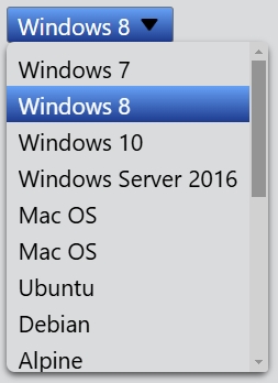
In the code below, you will create a comboBox. You can limit the height by setting the maxMenuHeight property if the dropdown list is too long.
const desktop = Desktop.instance();
const comboBox = new ComboBox(desktop);
comboBox.add('Windows 7');
comboBox.add('Windows 8');
comboBox.add('Windows 10');
comboBox.add('Windows Server 2016');
comboBox.add('Mac OS');
comboBox.add('Mac OS');
comboBox.add('Ubuntu');
comboBox.add('Debian');
comboBox.add('Alpine');
comboBox.add('CentOS');
comboBox.add('Android');
comboBox.add('iOS');
comboBox.add('Unix');
comboBox.add('FreeBSD');
comboBox.add('Palm OS');
comboBox.add('OS/2');
comboBox.add('RedHat');
comboBox.add('Solaris');
comboBox.add('Chrome OS');
comboBox.maxMenuHeight = 200;
comboBox.index = 1;